In-page images
A series of image layouts for use within the main body of your web page – all using the same Photoshop template.
Overview
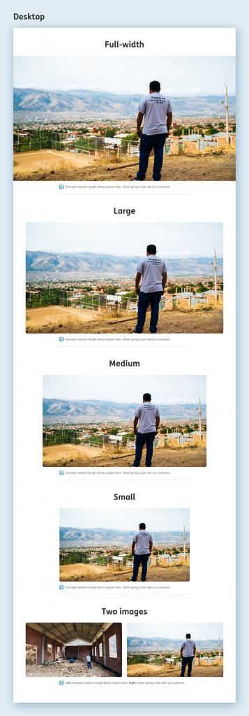
We have the following image layouts available to use in the body of your web page:
-
Full-screen
-
Large
-
Medium
-
Small
-
Two images
This is how all the different image variations look at desktop size:

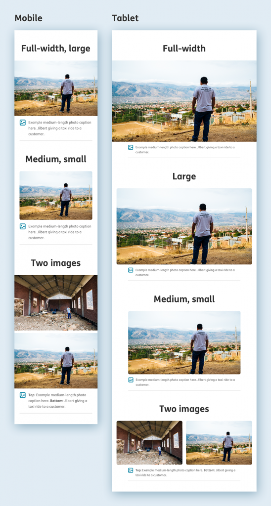
This is how they look across mobile and tablet sizes. You can see that a few of the different image variations are actually identical in their appearance. This is due to the limitations of the smaller grid we’re using when compared to desktop.

Guidance
-
TOP TIP: If in doubt you can’t go wrong alternating between large and medium image sizes throughout your page. This should work very well across all screen sizes.
-
Think about the visual flow of the page. Keep it varied and interesting. If you’ve just used a small image, maybe further down the page use a large image.
-
Use the ‘full-screen’ option very sparingly, when you want maximum impact. It takes up a lot of screen space!
-
It’s best to think about how it will look on the desktop layout, as this is where the differences in image size will be the most obvious.
-
If the page is already very long, but you need to include some more images, maybe look to use the ‘Two images’ variant, which takes up less space than two individual images.
Photoshop template
All in-page images should be created using this In-page Image Photoshop Template
