Promo
A visually engaging way to signpost people to an important, related webpage – ie. a campaign landing page or a form.
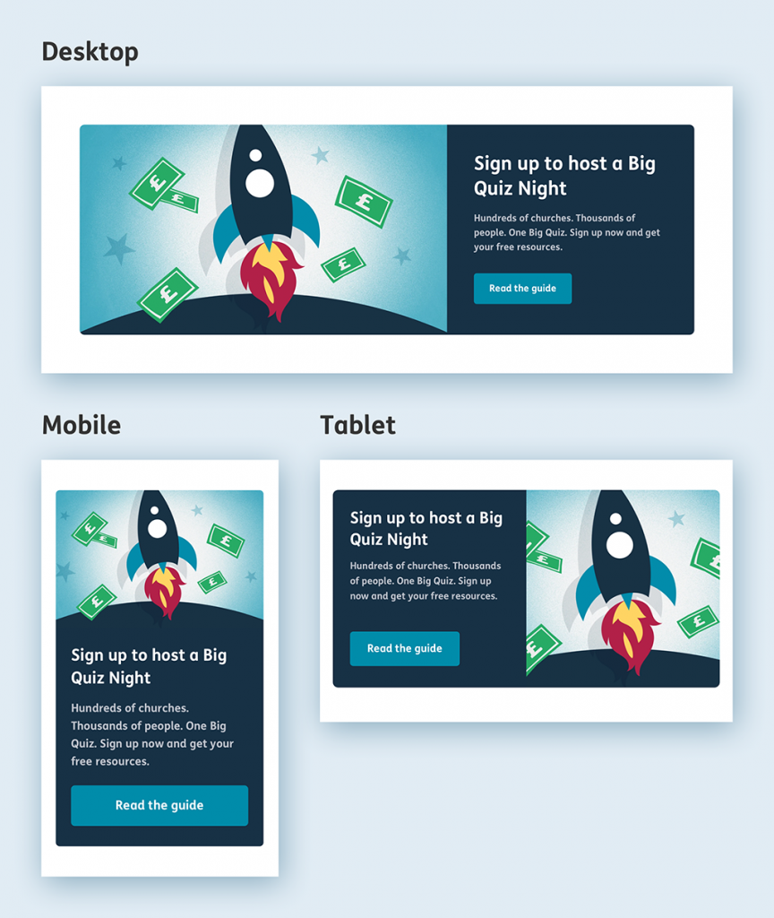
Standard variant
This is our standard ‘promo’ component. It works well in instances when you want to signpost to one key page. If you’re linking off to multiple pages then you should instead use our ‘nav cards’ component.
Nb. You can use more than one standard promo component on a page (2 max), but they should never sit right next to each other.
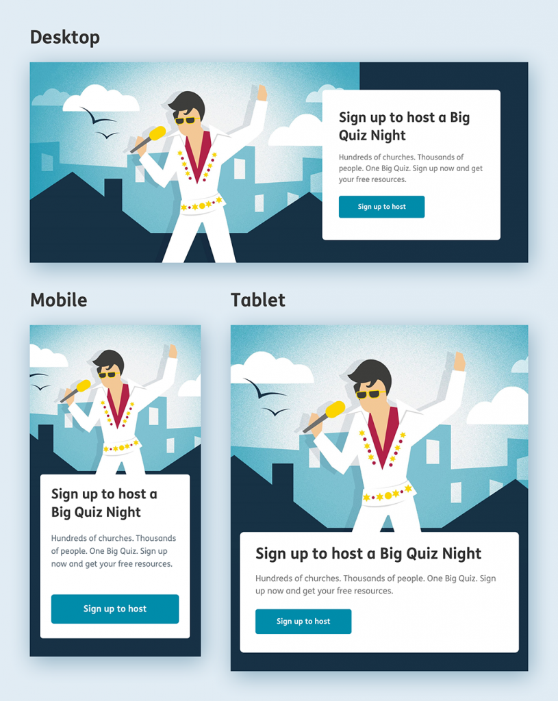
Full-width variant
This larger promo component is to be used sparingly. It is useful when you need to create some visual hierarchy between multiple promos on the same page. Ie. If one of the pages being promoted is more important than the other.
Nb. You should never use the full-width variant more than once on a page.
Wordcounts
-
Main sentence:
20 words
(110 characters max) -
Button:
10-20 characters
Image template
To make up a promo image use this Photoshop template
Nb. This component uses the same template as the Campaign banner.
How your image will be cropped
Once you’ve supplied your image using the above Photoshop template, your image will be automatically cropped and resized, using clever coding, so that it has the maximum visual impact across the different device sizes. (See images below)
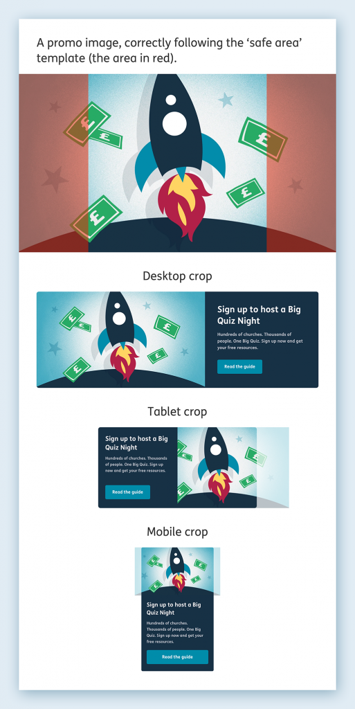
Cropping behaviour – Standard variant
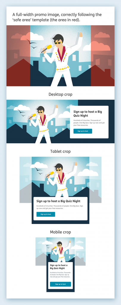
Cropping behaviour – Full-width variant