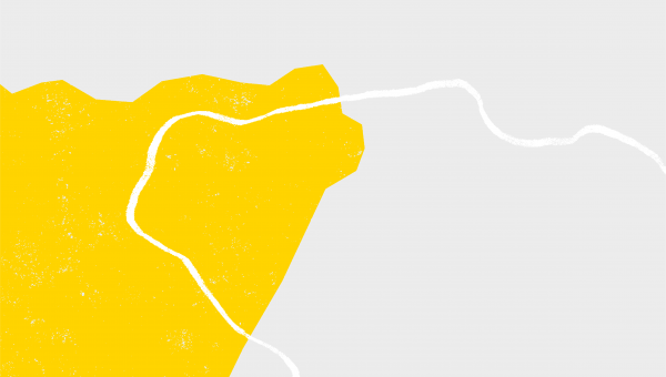
Device Application
Ratio guidelines for use with photography
The device is intended to enhance our visual language, but when used with photography, the focus of the photograph should remain the focus, therefore the brand device must not take over the design.
This ratio guideline provides a guide for how much space the brand device should use within your design. The solid country shape within the brand device should not use any more than 1/4 of your design.
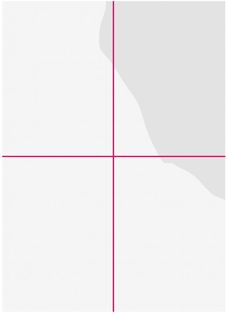
The space used by the solid country shape must equate to about 1/4 of the layout.
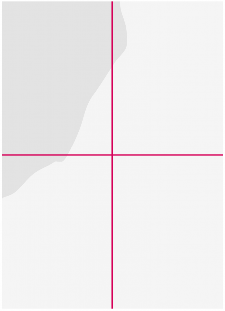
The elements can be placed on any corner/edge of the layout.

Example with photographic layout.
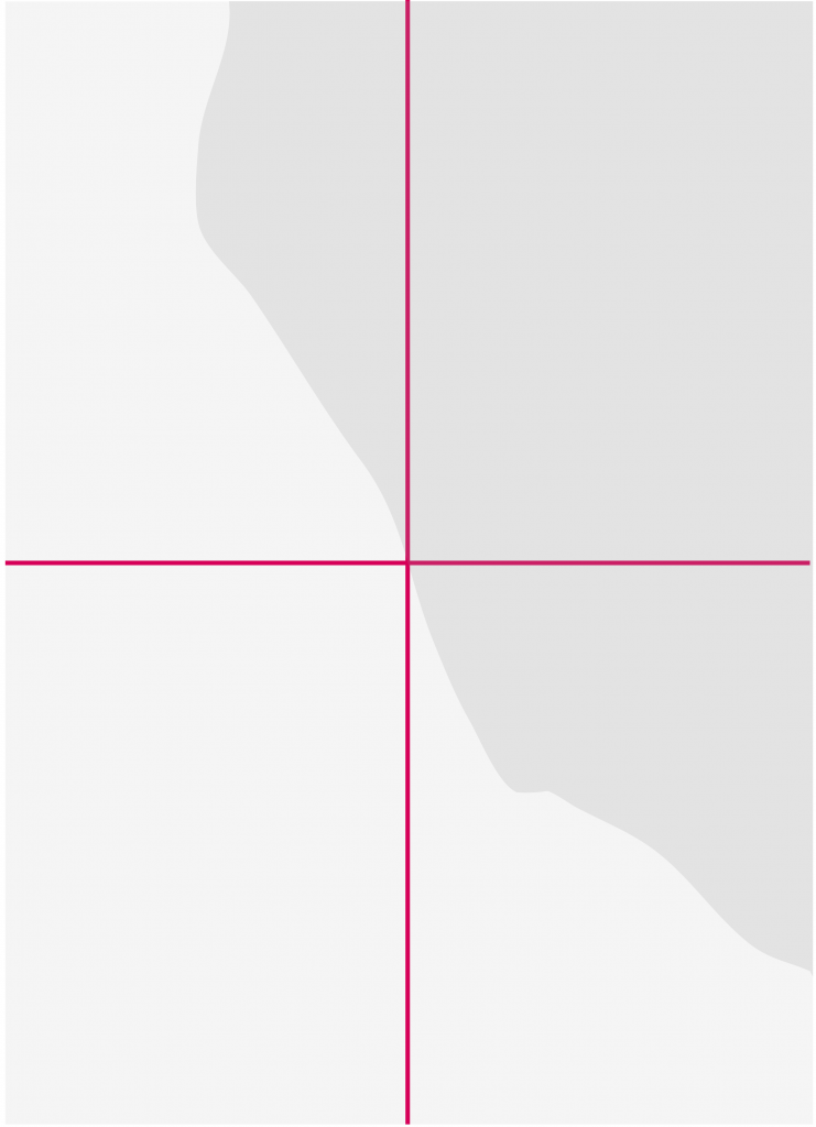
Incorrect ratio. The space used by the solid country shape exceeds 1/4 of the layout.
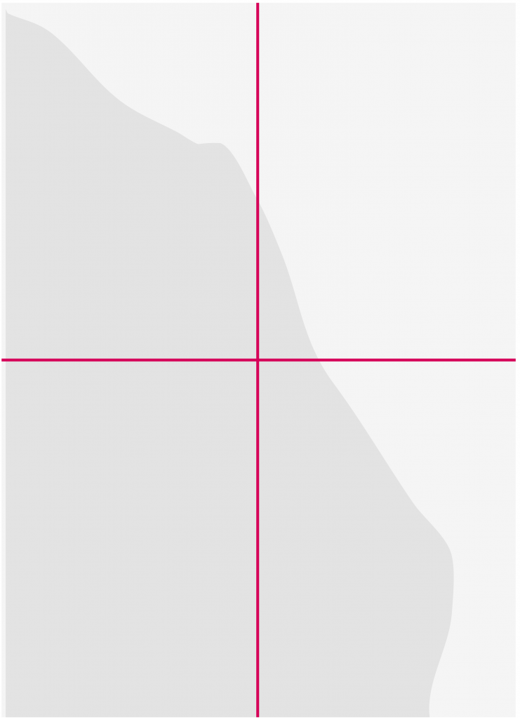
Layouts like this will hinder the use of photography and crowd the visual space.
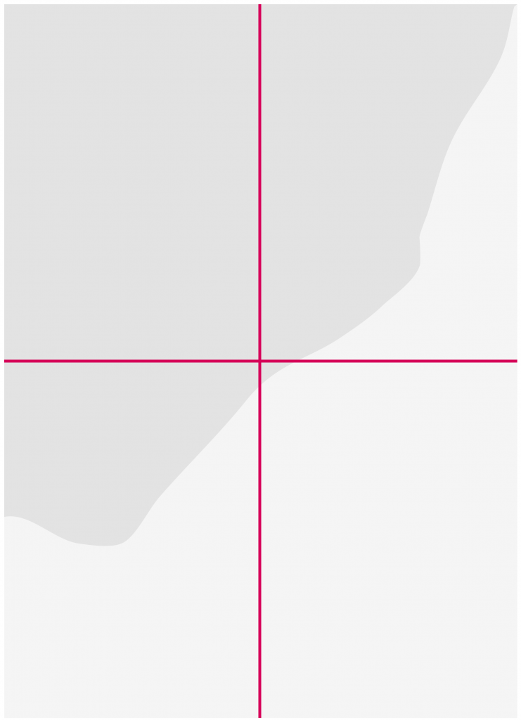
This example shows coverage exceeding 1/4 of the layout.
Layout guidelines
The brand device was designed to create a unified look and feel without a restrictive architecture that each layout must follow. Therefore there are several ways in which the device can be used in your designs, following a few simple principles.
Two basic principles.
- The keyline shape must always overlap on top of the solid.
- Solid and keyline shapes must always crop out of the image.
Here are some examples where the device has been used correctly:

Where photography and country shape allows, all copy can be cropped within the solid shape.
(See guidance at the end of this page on ‘Editing texture’ for instances where you may need to edit the texture for legibility when using copy within the solid shapes)

Heading and body copy all held within the keyline.

Heading and body copy all held within the keyline.

Copy doesn’t always have to sit within a shape if the photography or country shape doesn’t allow.
Here are some examples where the device has been used incorrectly:

Don’t use more than one of each shape on single page items.

Solid and keyline elements should never appear in full within a design, both the solid and the keyline shapes must always crop.

Solid and keyline elements should never appear in full within a design, both the solid and the keyline shapes must always crop.

Solid and keyline elements should never appear in full within a design, both the solid and the keyline shapes must always crop.
Editing texture
The solid elements have been created with texture, and there are certain instances where the texture may be more visible such as when you use darker images.
If your design uses the solid shape to hold copy, it is important to check that the texture does not interfere with the legibility of the copy.
If you feel some of the texture needs to be edited in order to avoid issues with legibility, then the following steps explain how this should be done:
- Open your design file
- Eye drop the device colour
- Use the brush tool to fill in the areas of texture that are interfering with the copy, but only remove areas of texture that are necessary.
Do not:
- Cover the texture by drawing a coloured box in InDesign.
- Fill your text box with a background colour.
It is worth considering your layout depending on the photograph you are using. If the photograph has a very dark background, it may be better to avoid using copy over the solid shape to avoid obvious editing of the texture.


