Quotations
To keep consistency across all our communications we have developed two key ways to visualise quotations. These two options are the only permitted way of expressing quotes. We have guidance and templates in the detail below.
Options
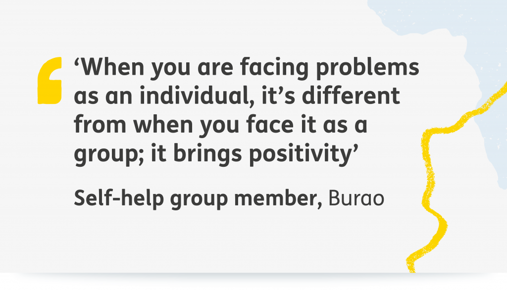
General Quote
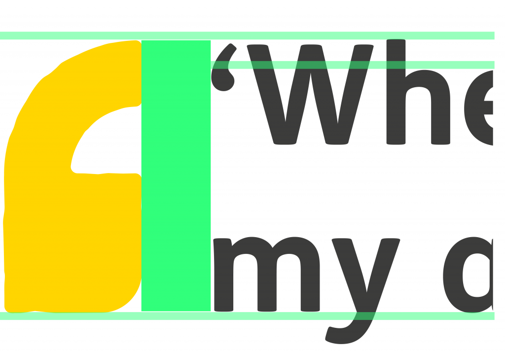
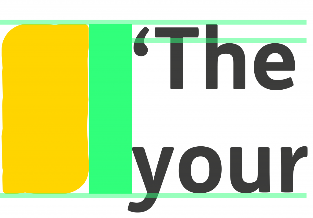
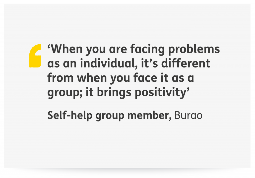
This open quotation mark is for use on general quotations such as quoting an individual or an author excerpt. The spacing between the shape and the text should be exactly half the width of the shape of the mark. The text should be set so that it is two lines at the height of the quotation mark. With the ascender of the top line being the high point and the baseline of the second line being the low point.
Bible Quote
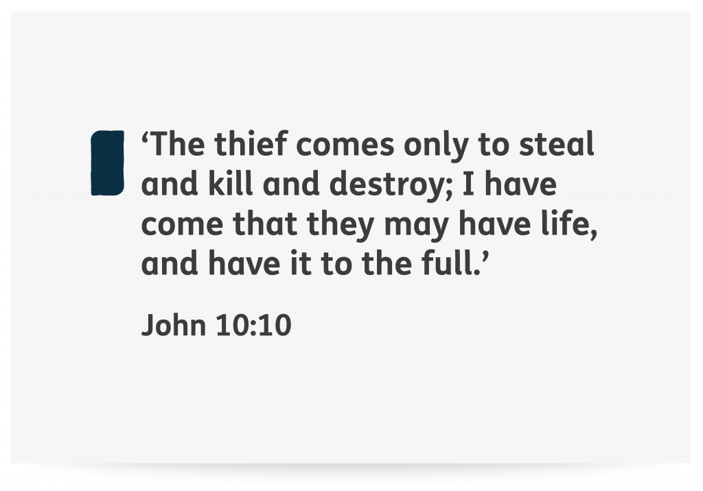
This bespoke shape is for use with bible quotes exclusively. The spacing between the shape and the text should be exactly half the width of the shape of the mark. The text should be set so that it is two lines at the height of the quotation mark. With the ascender of the top line being the high point and the baseline of the second line being the low point.
Translations
We also have templates available for French and Spanish translations which can also be downloaded.
Colour options
For white backgrounds
Quote styles can be used on white backgrounds for example pull quotes within documents/articles/web copy. In these instances, two colour options are allowed.
For colour backgrounds
Quote styles can also be used on coloured backgrounds that use our primary and secondary colours. Two colour options are allowed.
Note: If you have a need for using the quote marks on a background colour other than our core and secondary colours, please email design@tearfund.org for guidance, as this would need to be considered on a case by case basis where required and approved.
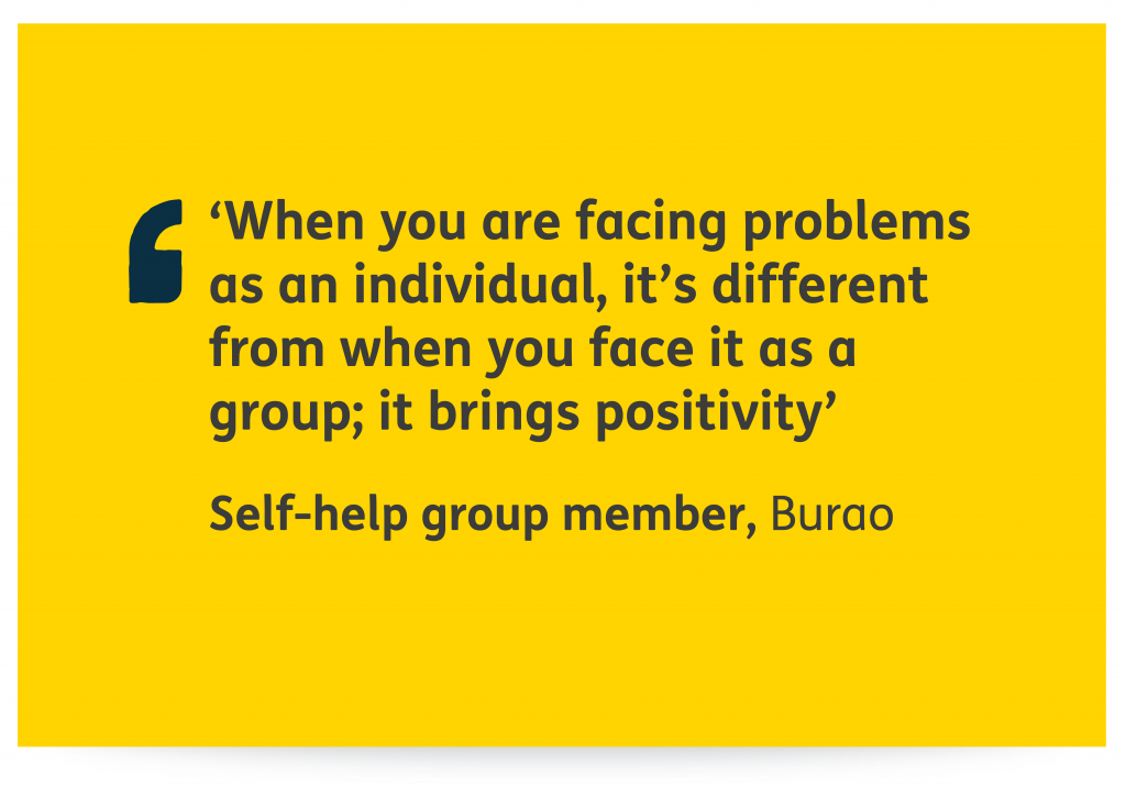
On yellow backgrounds a navy quote mark or bible reference mark should be used. The copy remains 90% grey.
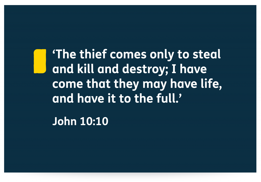
On navy backgrounds a yellow quote mark or bible reference mark should be used. The copy should be white.
Positioning/placement
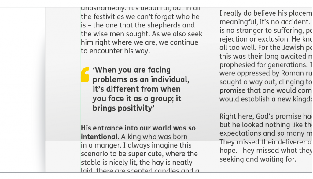
When positioning within body text, align the left side of the quote mark with the left of your text column.

