Brandmark
The Tearfund logo is a symbol of our mission to transform lives by following Jesus where the need is greatest. The ‘T’ in the logo represents a cross – a nod to our Christian distinctive.

Colour
The Tearfund logo is only shown in ‘Tearfund blue’ as shown. The text is always white.
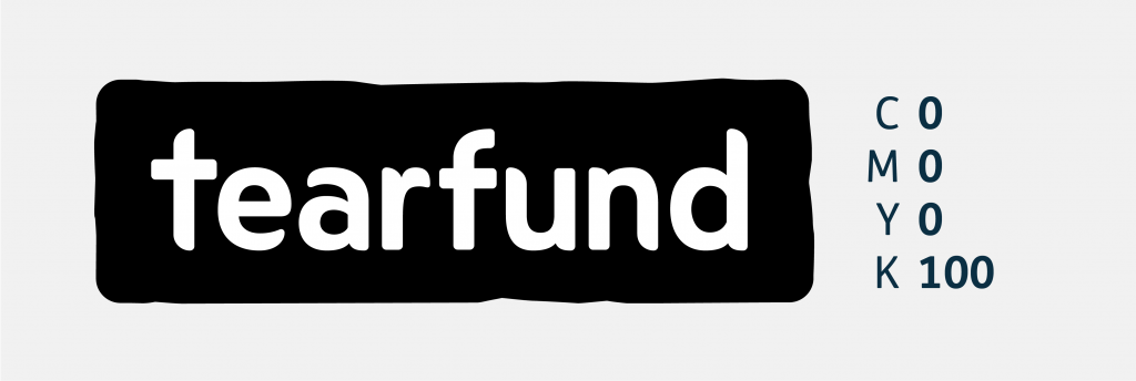
Where colour print restrictions apply, a white or black logo may be used. This is the only instance where the logo is permitted to be used in a colour other than ‘Tearfund blue’, and only with prior permission from the Tearfund Design Team. Email design@tearfund.org for more information.

For limited use only. Permission required.

100% black – for use on black and white documents.

Don’t use any secondary, supporting or non Tearfund colours for the brand mark.

Don’t use any black or white versions of the logo (or other colours than Tearfund Blue) on photography.
Spacing and sizing

Taking the length of ‘u’ and ‘n’ in the logo used, leave at least this area clear around the logo, preventing any other graphic elements such as logos or type interfering.

Our logo requires breathing space around it to maximise its visual presence. Placing it tight to the edge of any elements of borders is not allowed.

Keep the brand mark’s proportions true. Don’t stretch or distort it to fit any design or layout.

Don’t rotate the brand mark for any reason. The mark must remain horizontal.
Minimum size
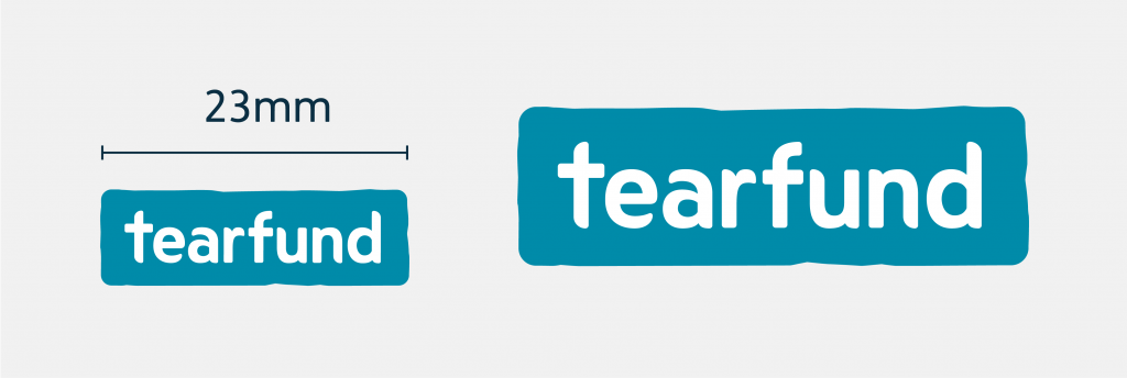
The smallest size the Tearfund logo can be used is 23mm wide.


