Partnership logos
There are occasions where a design needs to feature additional partner logos alongside the Tearfund logo.
In these instances we have templates that provide spacing and layout guidance for using multiple logos within your design.The templates are set up at A6-A5 sizes.
Important note: These templates are currently only available with the UK sign-off details so nation details would need to be added if required.
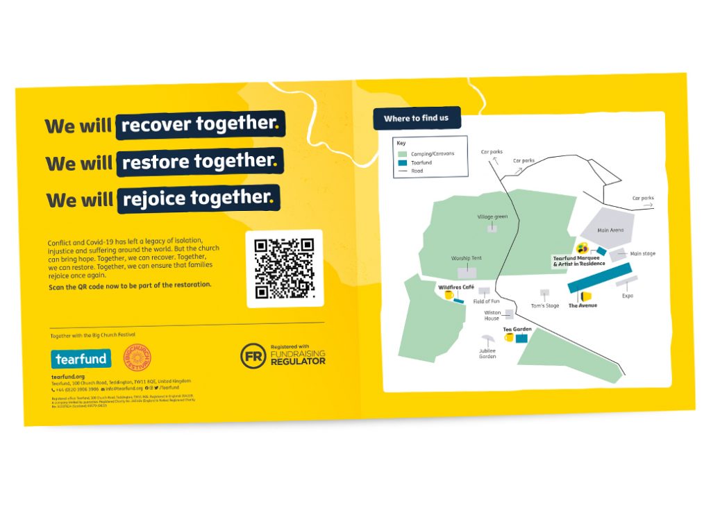
The image below demonstrates what you can expect from the templates provided.
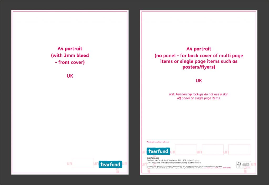
Partnership logos on covers
When you are creating a mutipage item such as a brochure or booklet, the partnership logos sit in the bottom right corner of your design and follow the spacing within the provided template
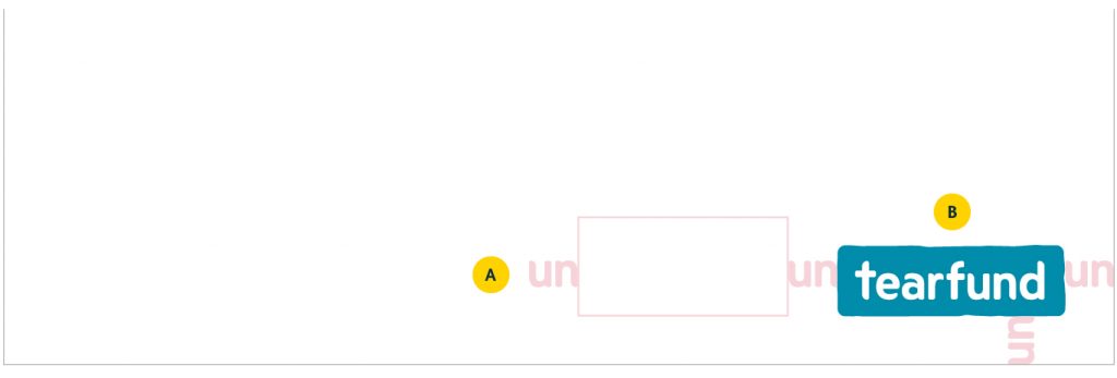
A. The partnership logos run along the bottom. Multiple partner logos can be used but must follow the same spacing rules between each as provided in the templates.
B. The Tearfund logo is always the last logo in the list so that it sits consistently in the bottom right corner.
Partnership logos within sign-offs
When you need to add partner logos to a sign-off the following template should be used as provided.
For sign-offs with partner logos, the layout differs from our standard corporate sign-off:
- The Tearfund logo sits above the URL allowing the partner logos to run along the top of the sign-off details.
- A descriptor is added above the sign-off to explain the partnership between Tearfund and the partner organisations. This copy should be provided by your project manager or the copy team.
- A keyline stroke is added to add a break point above the sign off.
On multipage items such as brochures and booklets the partnership sign-off sits on the back cover.
On single page items such as poster the partnership sign-off should be used as provided. No sign-off panel is used on single page items where use partner logos.
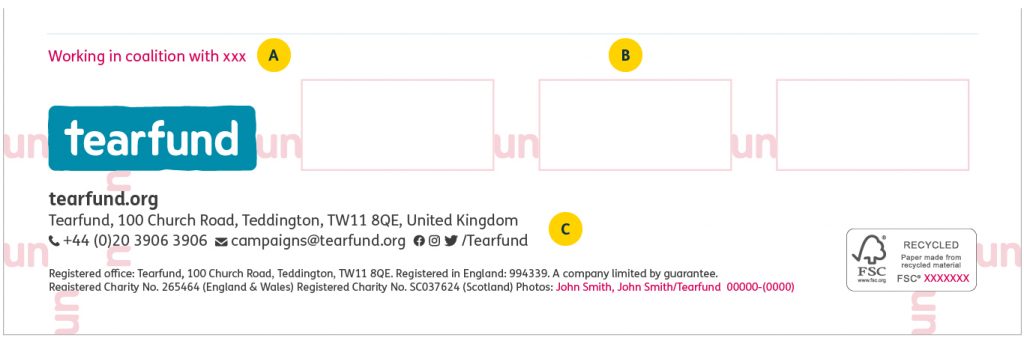
A. Descriptor and keyline stroke always sits above the sign-off as provided in the templates. The point size is preset within the relevant templates for each A-size. The copy should be updated as required for the descriptor and made 90% grey once completed.
B. The partner logos sit alongside the Tearfund logo using the spacing as provided in the templates. In this instance the Tearfund logo is always first in the list.
C. Sign-off details sit underneath the partner logos as preset in the templates provided per A-size.
Multipage items also include the FSC logo, which is included in the templates. Single page sign-offs do not use the FSC logo so this can be removed in those instances, but all other template elements must remain in the position provided.
Design Examples
Events
An example of a design where we often need to use the partnership logo template is for partnership events such as ‘Big church day out’ and ‘Faith as the musicals’. The below design shows and example of how the template was implemented for BCDO.
