Master logo
Tearfund’s logo features a ‘t’ that also serves as a cross. This symbolises our calling to follow Jesus’s example to bring hope and transformation to those in extreme poverty.
We use our Tearfund blue master logo at every audience touchpoint possible to build brand value and recognition.
Monochrome logo
The mono version of our logos should only be used when colour use is not an option. e.g printing in black and white.
Please contact natasha.gibson@tearfund.org to check usage.
Monochrome - white
For limited use only. Permission required
Monochrome - 100% black
For use on black and white documents.
Spacing
Taking the length of ‘u’ and ‘n’ in the logo used, leave at least this area clear around the logo, preventing any other graphic elements such as logos or type from interfering.
Size
The smallest size the Tearfund logo can be used is 23mm wide.
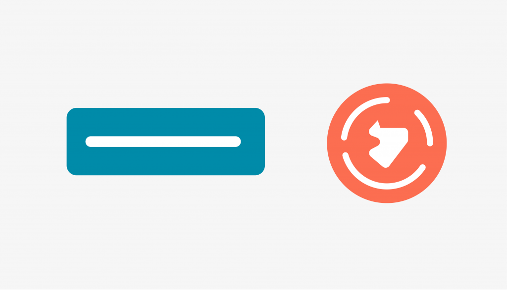
Sensitive locations
Our alternative logo for use in security-sensitive regions where the cross in our master logo could compromise the safety of our staff or continuity of our work.
The same colour, spacing and sizing rules apply as per the main Tearfund logo.
Note: this is not an optional logo choice; it is intended for specific use only.
This version is available on request. Please email natasha.gibson@tearfund.org
Tearfund family
The Tearfund family has 11 members across the world. Tearfund UK was the first family member, set up in 1968 by the Evangelical Alliance.
UK, Australia, Netherlands, New Zealand, Belgium, France, Switzerland, Ireland, Canada, USA, Germany
The main brand mark is intended as the primary one for use, but the other versions are for each Tearfund Family to use under their own additional instruction
Please make sure you gain any additional information from your respective Tearfund Family contact.
Brand partnerships
For brand partnerships, we display both our logo as well as our partner’s. Space between each logo uses the ‘un’ from the Tearfund logo. When sizing the logos, start with the Tearfund logo, then optically size and center the partner logo for visual balance.
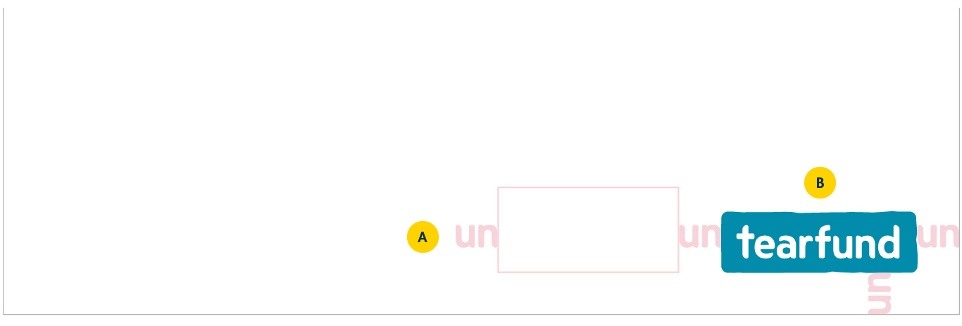
On covers
On brochure and booklets, the partnership logos sit in the bottom right corner of your design
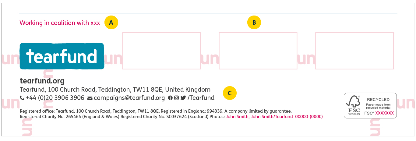
On sign-offs
On brochures and booklets the partnership sign-off sits on the back cover.
On posters and fliers the partnership sign-off should be used as provided.
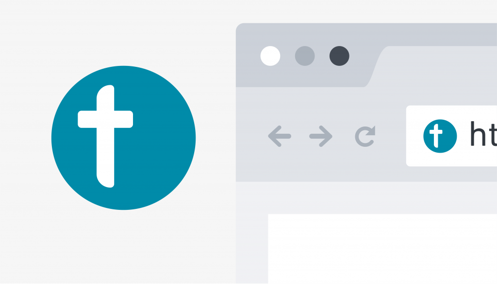
Favicon
Our favicon is a simplified representation of our brand that captures our identity using our most recognisable brand assets. It’s used where our full logo can not be used. The icon is not a replacement for the main logo and can not be used alone.
All countries within the Tearfund Family should use the favicon only as supplied and specified here.
Where it’s used
- Social media
- Internet browser
Misuse
Only use our logo in our Tearfund blue, white and black
Don’t use black or white versions of the logo (or other colours than Tearfund Blue) on photography.
Our logo requires breathing space around it to maximise its visual presence. Placing it tight to the edge of any elements of borders is not allowed.
Keep the brand mark’s proportions true. Don’t stretch or distort it to fit any design or layout.
Don’t rotate the brand mark for any reason. The mark must remain horizontal.
Resources
Download our logo asset pack and templates for use on print material