Core colours
Tearfund’s brand prominently features our core blue and bold, vibrant yellow. This combination helps us stand out.
For contrast and variation, these can be complemented with navy and light blue.
Core blue
-
RGB
0,129,158 -
CMYK
100,16,23,18 -
HEX
#00819E
Core yellow
-
RGB
252,213,0 -
CMYK
0,15,100,0 -
HEX
#FCD500
Core light blue
-
RGB
225,236,244 -
CMYK
9,0,1,4 -
HEX
#E1ECF4
Core navy
-
RGB
23,49,69 -
CMYK
98,76,41,51 -
HEX
#173145
Supporting colours
Our supporting colours can be used for text, graphics and illustrations when a broader palette is needed.
Supporting purple
-
RGB
119,45,129 -
CMYK
65,95,5,2 -
HEX
#772C81
Supporting red
-
RGB
165,31,67 -
CMYK
28,989,58,16 -
HEX
#A51F43
Supporting green
-
RGB
0,124,82 -
CMYK
89,26,79,11 -
HEX
#007C52
Supporting pink
-
RGB
209,51,88 -
CMYK
14,91,50,1 -
HEX
#D13358
Supporting blue
-
RGB
11,90,159 -
CMYK
94,64,7,0 -
HEX
#0B5A9F
Supporting orange
-
RGB
203,66,22 -
CMYK
13,84,100,5 -
HEX
#CB4216
Core colours
These colourways keep sufficient contrast for accessibility when used for text.

Core yellow on navy

90% black or navy on light blue

White on navy
Supporting colours
White on supporting purple

White on supporting red

White on supporting green

White on supporting pink

White on supporting blue

White on supporting orange
Showcase
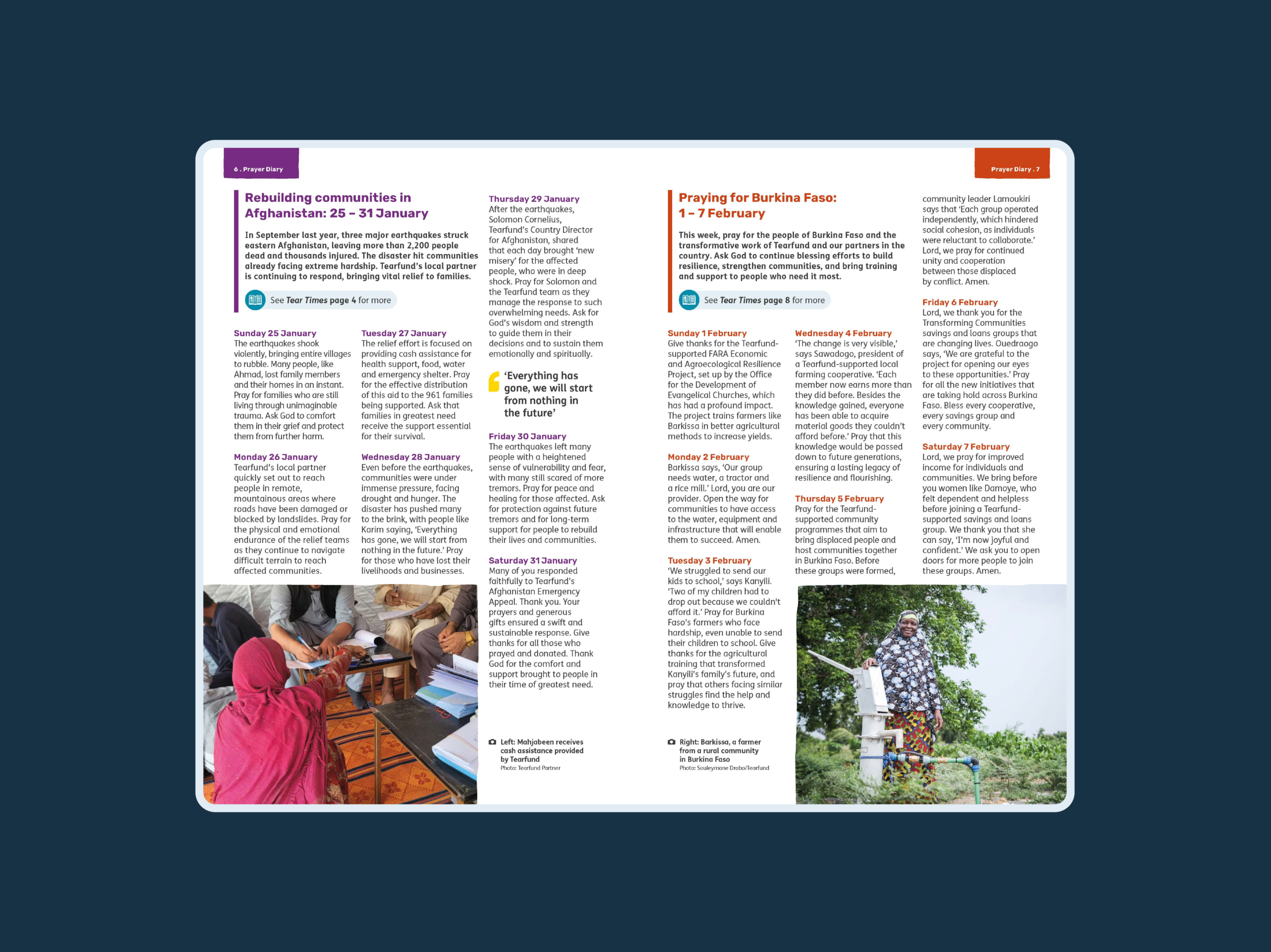
Prayer Diary
In the Prayer Diary, we use our supporting colours to help separate different sections of text.
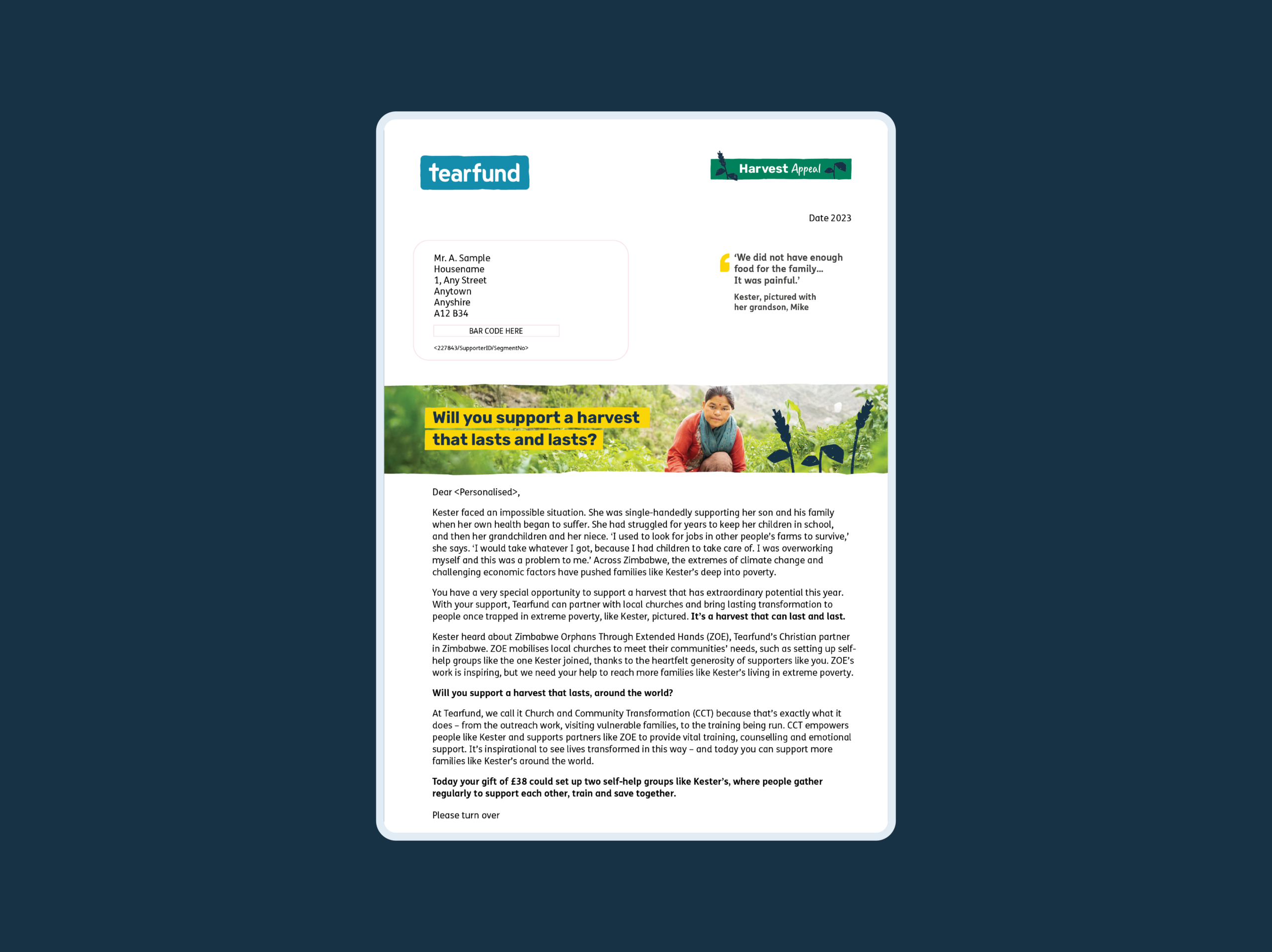
Harvest
Our seasonal appeals (Lent, Harvest and Christmas,) each have a different colour lozenge and decorative illustration that reflects the season. Harvest often uses green, to signify stories of agriculture and crop growth.
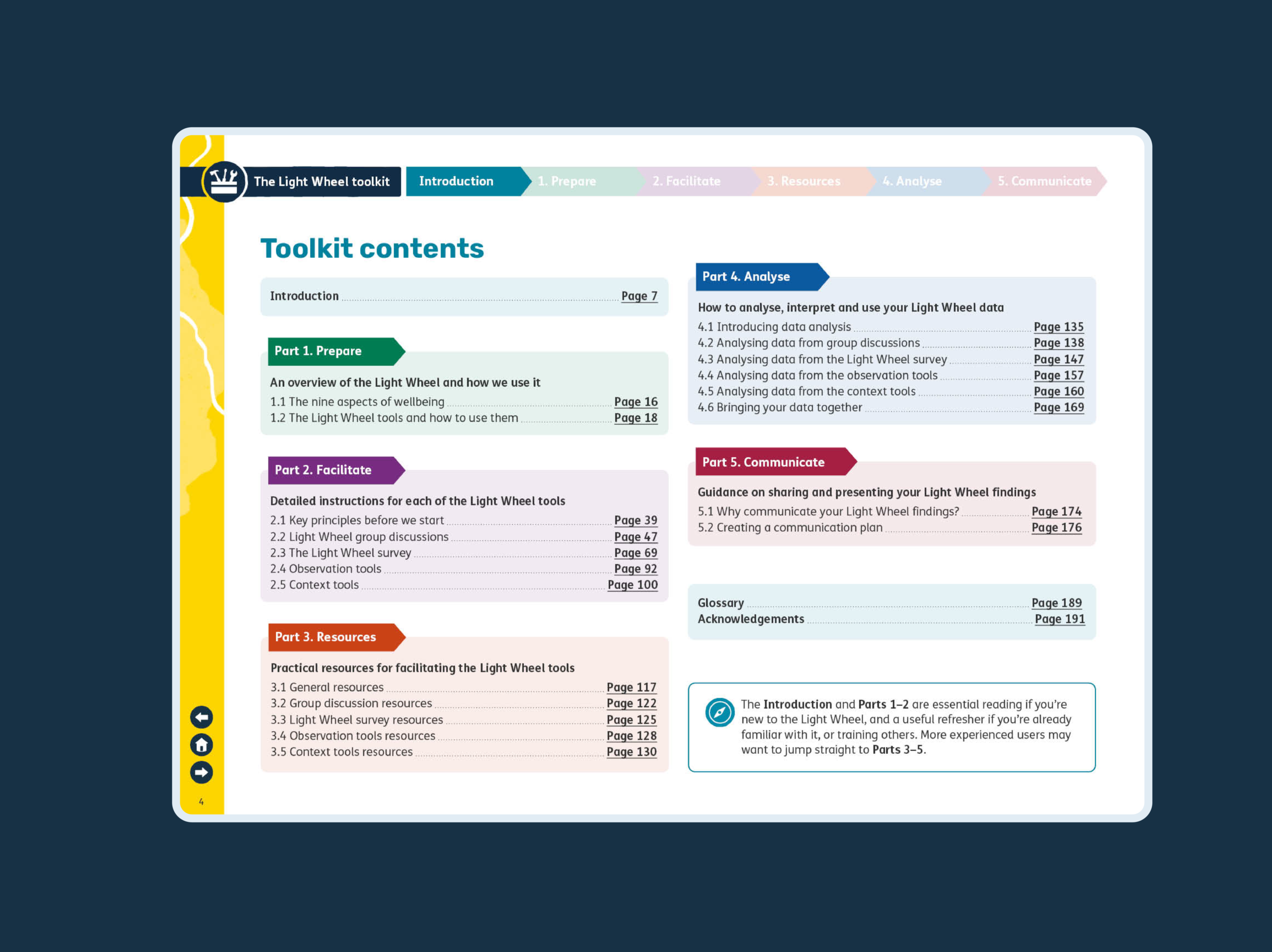
Light Wheel
In the Light Wheel, we use our supporting colours to help separate different sections.
Resources
Download our colour library palette in ASE format